Snapfit
Snapfit is a fitness-nutrition app for people who want to eat well without doing the math. Snap a photo of your meal and it reads the food back to you: calories, protein and the numbers that matter, powered by AI. The brand pairs a vivid, organic green with an open sky blue to hold two ideas at once: real food, and the freedom of a lighter, guilt-free routine.
- Client
- Snapfit
- Year
- 2025
- Services
- Brand Identity · Art Direction
- Tools
- Figma · Illustrator
Concept
Snapfit turns nutrition into something effortless. Point the camera at a plate and the app does the work, reading calories, protein and more, so people can focus on results instead of spreadsheets.
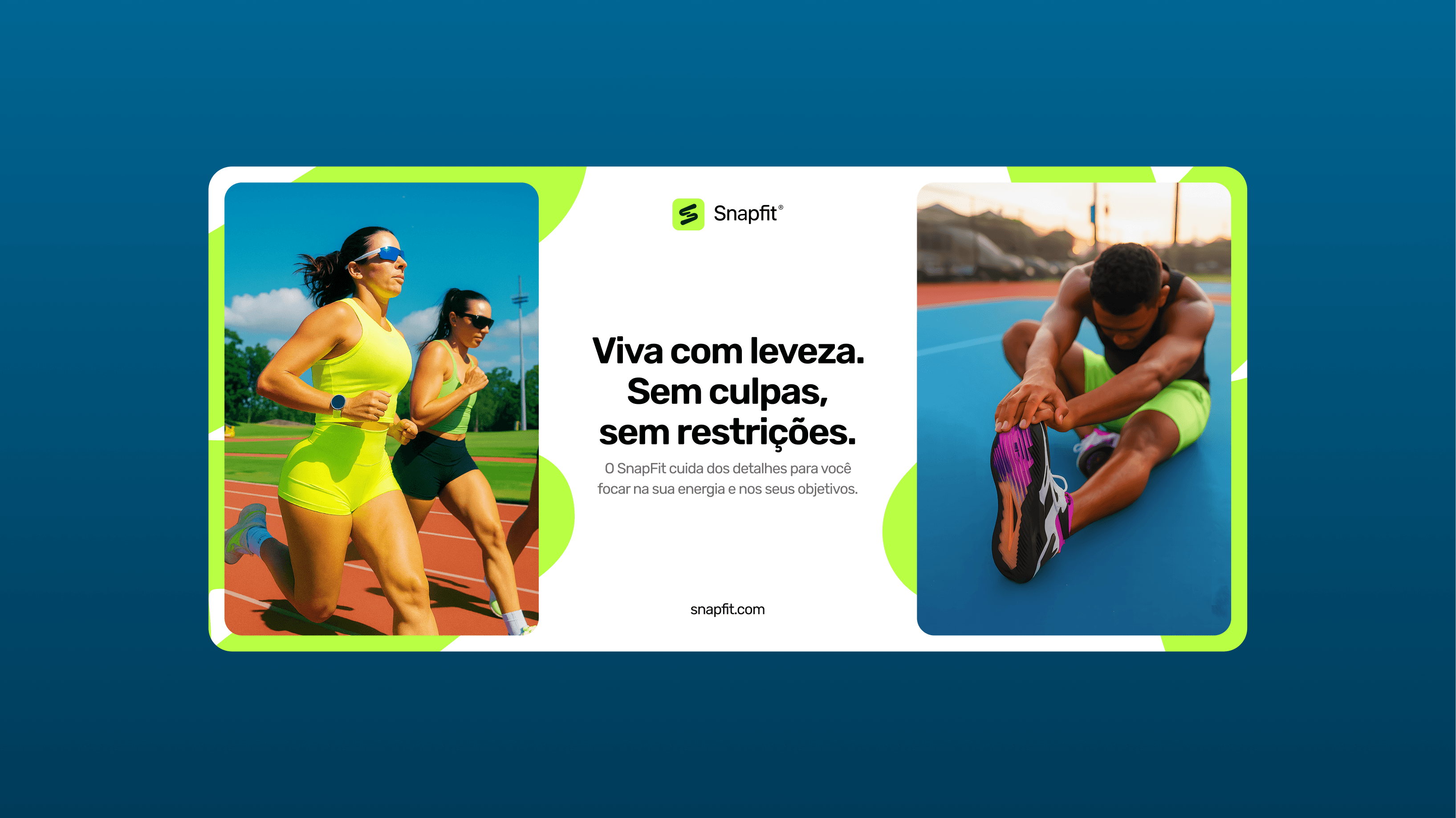
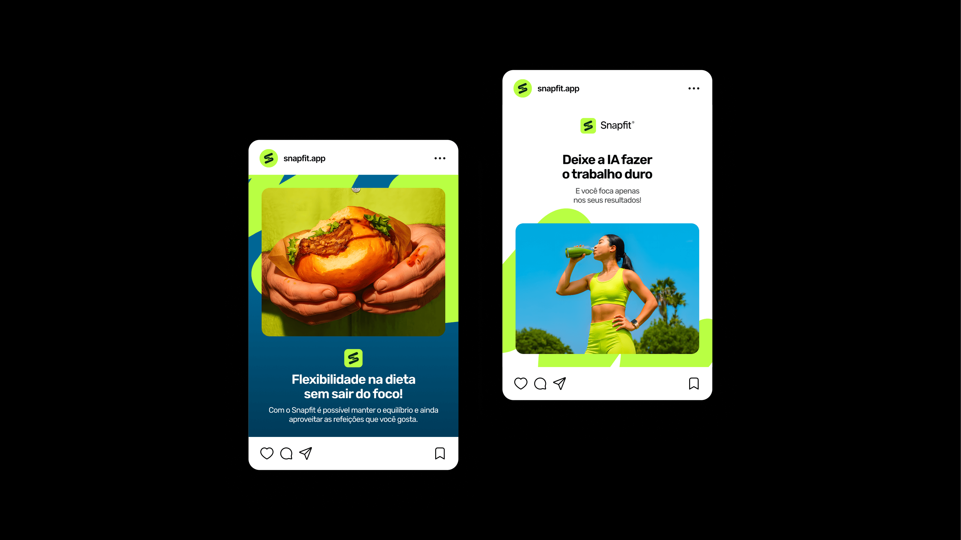
The brand was built on a single tension: discipline without restriction. Instead of the guilt and rigidity common to diet apps, Snapfit speaks to balance, lightness and freedom, the feeling of eating well and still living fully.
Personality
The tone is light, confident and encouraging. No guilt, no policing, no fine print. Snapfit talks to people who take their health seriously but refuse to make it joyless, so the voice stays warm, direct and a little playful.
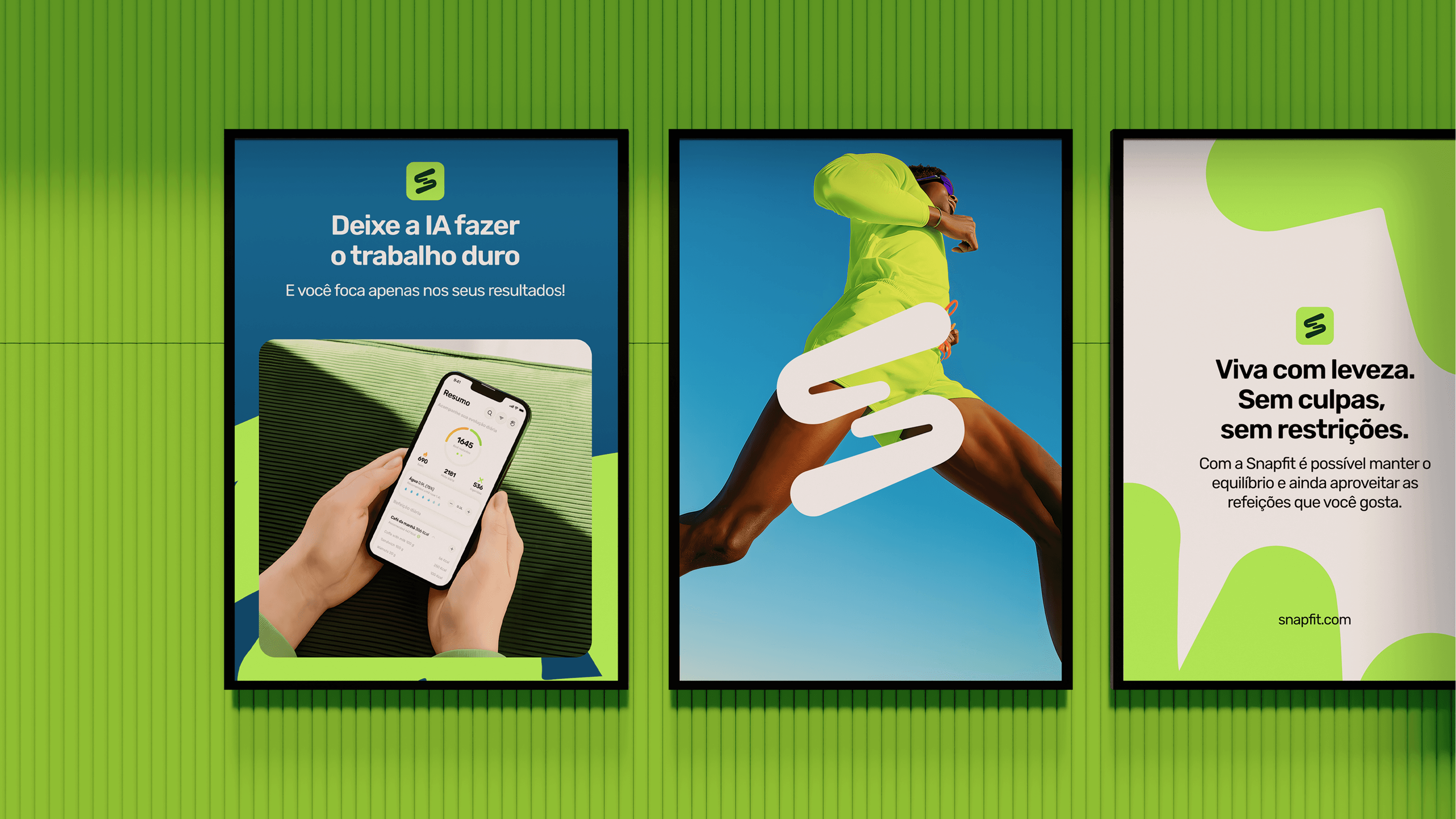
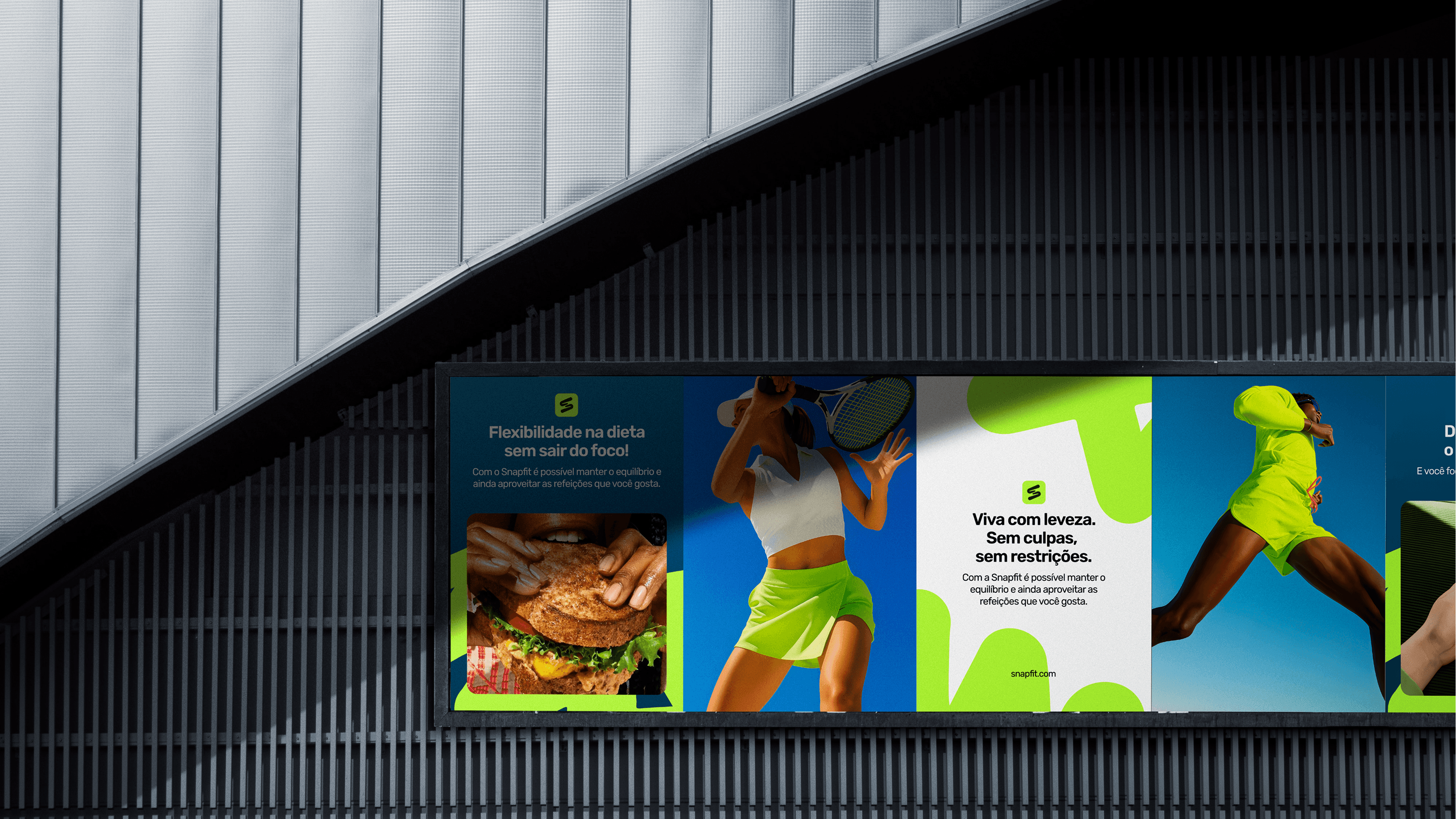
- Live light. No guilt, no restrictions.
- Flexibility in your diet, without losing focus.
- Let AI do the hard work. You focus on your results.
- Decode your plate and live with more health.
Symbol
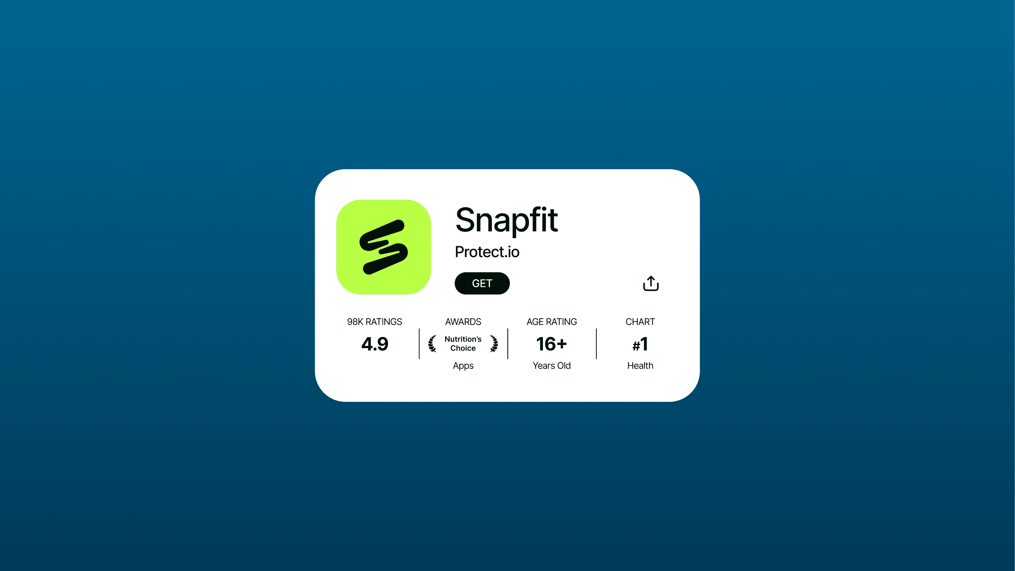
The symbol is an organic, flowing movement that resolves into an S. It was designed first as an app icon: simple, energetic and instantly recognizable at small sizes, with a fluidity that echoes motion, food and life rather than rigid geometry.
Color
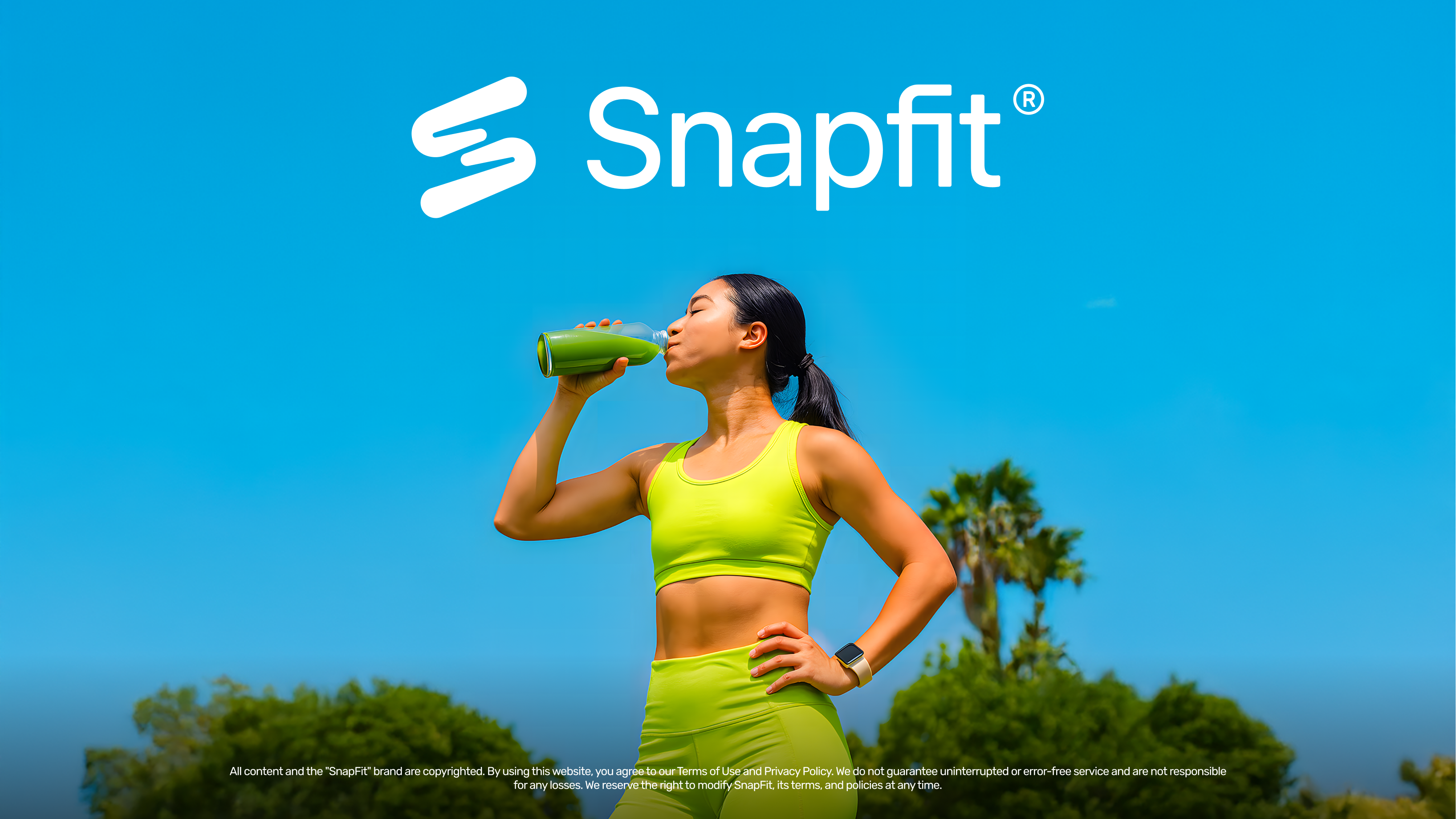
Two forces drive the palette. A vivid lime green leads as the primary, standing for the organic, for food and energy. An open sky blue brings the counterpoint: freedom, air and calm. Off-white holds the space between them clean and legible.
- Lime #B9FF43: the primary, organic and energetic.
- Light Lime #DBFF95: soft support and highlights.
- Deep Blue #00557A: the open-sky tone, for freedom.
- Astronaut Blue #003B59: a deep base for contrast and depth.
- Off White #FAFAFA: clean space and legibility.
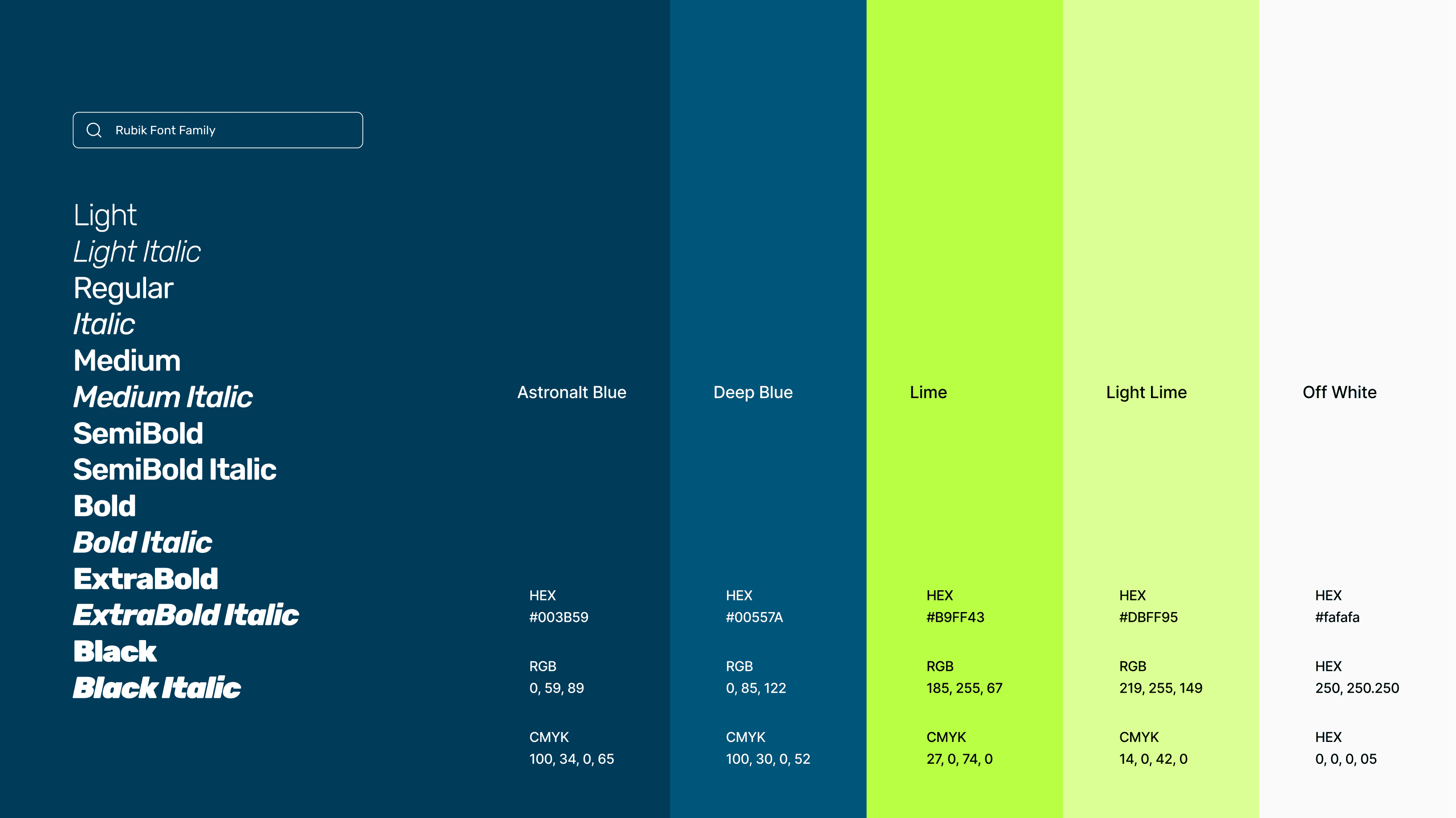
Typography
Rubik carries the system, a rounded, friendly sans that stays legible from app UI to outdoor scale. Its full range of weights gives the brand clear hierarchy while keeping the warm, approachable tone consistent everywhere.
Brand in use
The system was built to flex. From the app interface and App Store to social, print and outdoor, the identity holds its energy and clarity at any scale, always reading as Snapfit.
Outcome
The result is a confident, contemporary identity ready to scale, a brand that makes healthy eating feel light, modern and genuinely effortless across every touchpoint, from the app icon to the billboard.